迅豐企業
| Service | Brand Strategy, Visual Identity Design |
| Year | 2019 |
| Client | 迅豐企業 |
| Design | The Yi W Design |
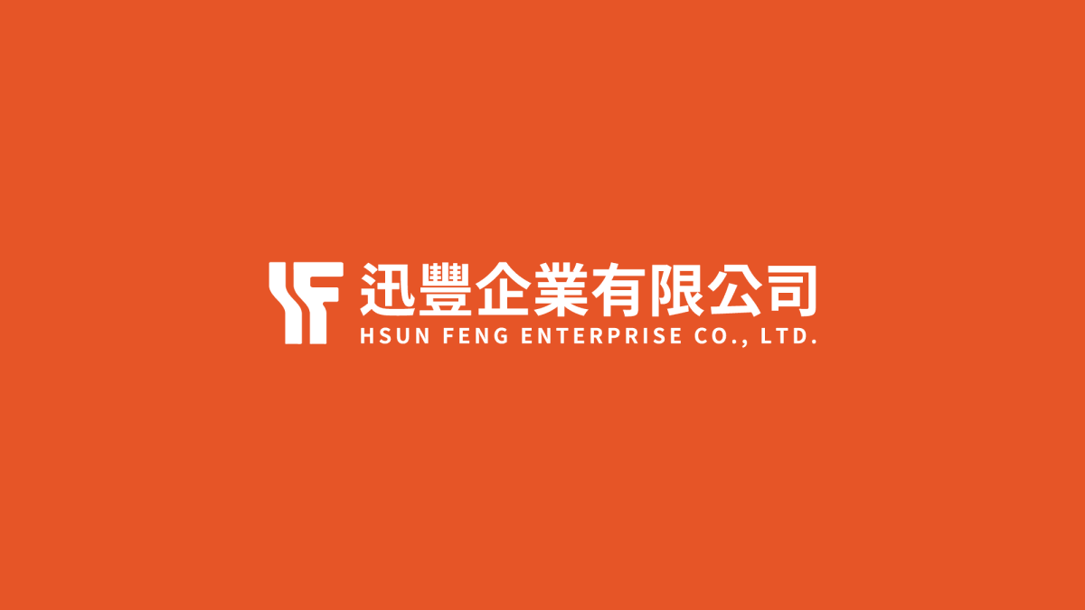
迅豐企業專注於廢棄建材與五金回收相關業務,品牌核心在於「循環再生」與「資源重構」。
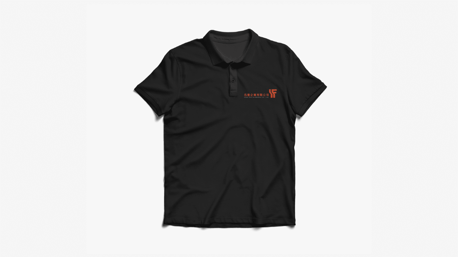
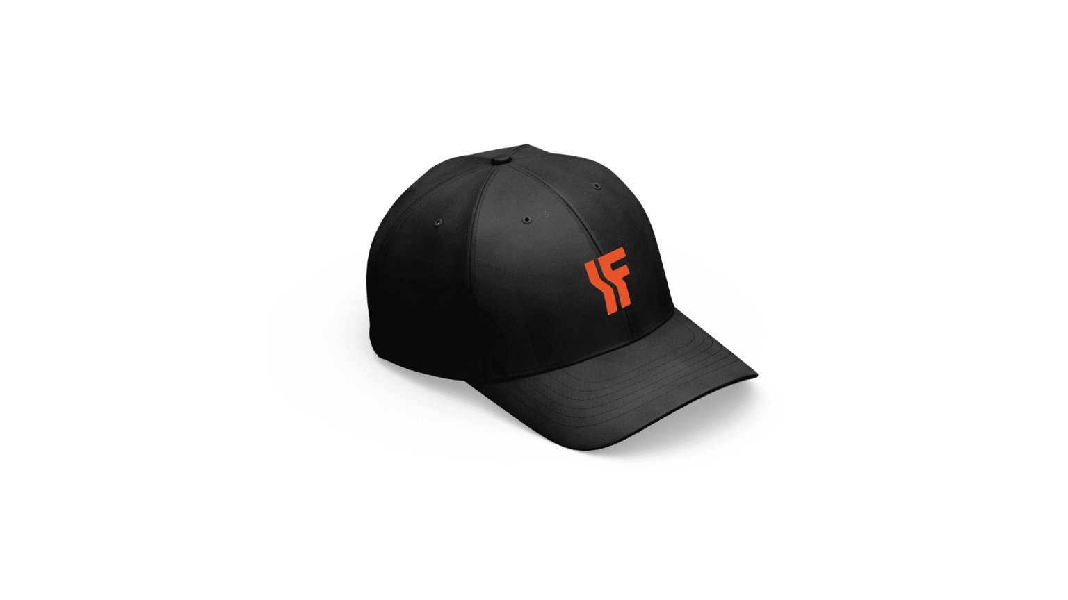
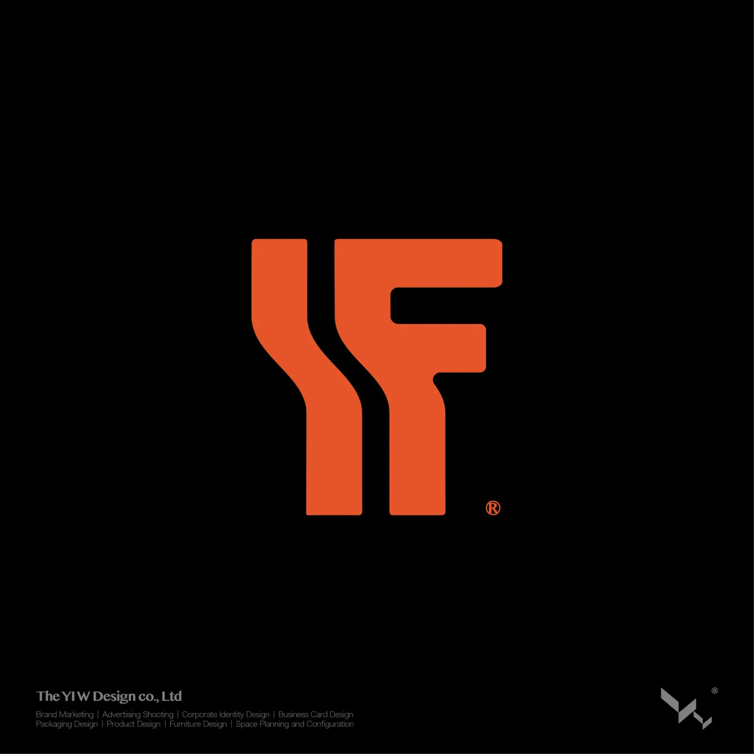
本次設計以企業英文縮寫 H、F 為基礎,發展品牌識別系統,透過穩重、結構性強的線條語彙,建立專業且可信賴的品牌形象。
視覺概念以「向下扎根,向上萌生」為核心意象,象徵回收再利用與永續循環的品牌精神,將環保價值轉化為具象的視覺語言。
品牌識別延伸至車體設計,並以橘與黑作為主色調,強化視覺辨識度,同時提升品牌在道路與工地場域中的存在感。
設計不僅建立識別,更讓永續理念在日常營運中被看見。
Shun Feng Enterprise specializes in recycled construction materials and metal waste recovery. The brand is built around the idea of circular regeneration and resource transformation.
The identity system is developed from the company initials “H” and “F”, using strong, structural linework to communicate stability, reliability, and professionalism within an industrial context.
The visual concept, “rooted downward, growing upward,” symbolizes the cycle of recycling and renewal, translating sustainability into a clear visual language.
The brand identity was further extended to vehicle livery design, using orange and black as primary colors to enhance visibility, energy, and recognition in industrial environments.
Design here goes beyond identity—it makes sustainability visible in everyday operations.