首頁 > 精選案例 > LOGO Design > 迅豐企業
迅豐企業
| Service | LOGO Design |
| Year | 2020 |
Context
迅豐企業專注於廢五金回收與再生資源處理,業務涵蓋金屬回收、分類與再利用。在循環經濟逐漸成為產業趨勢的背景下,品牌需要建立更具現代感與信任感的視覺識別系統,以強化其在資源回收產業中的專業定位。
Approach
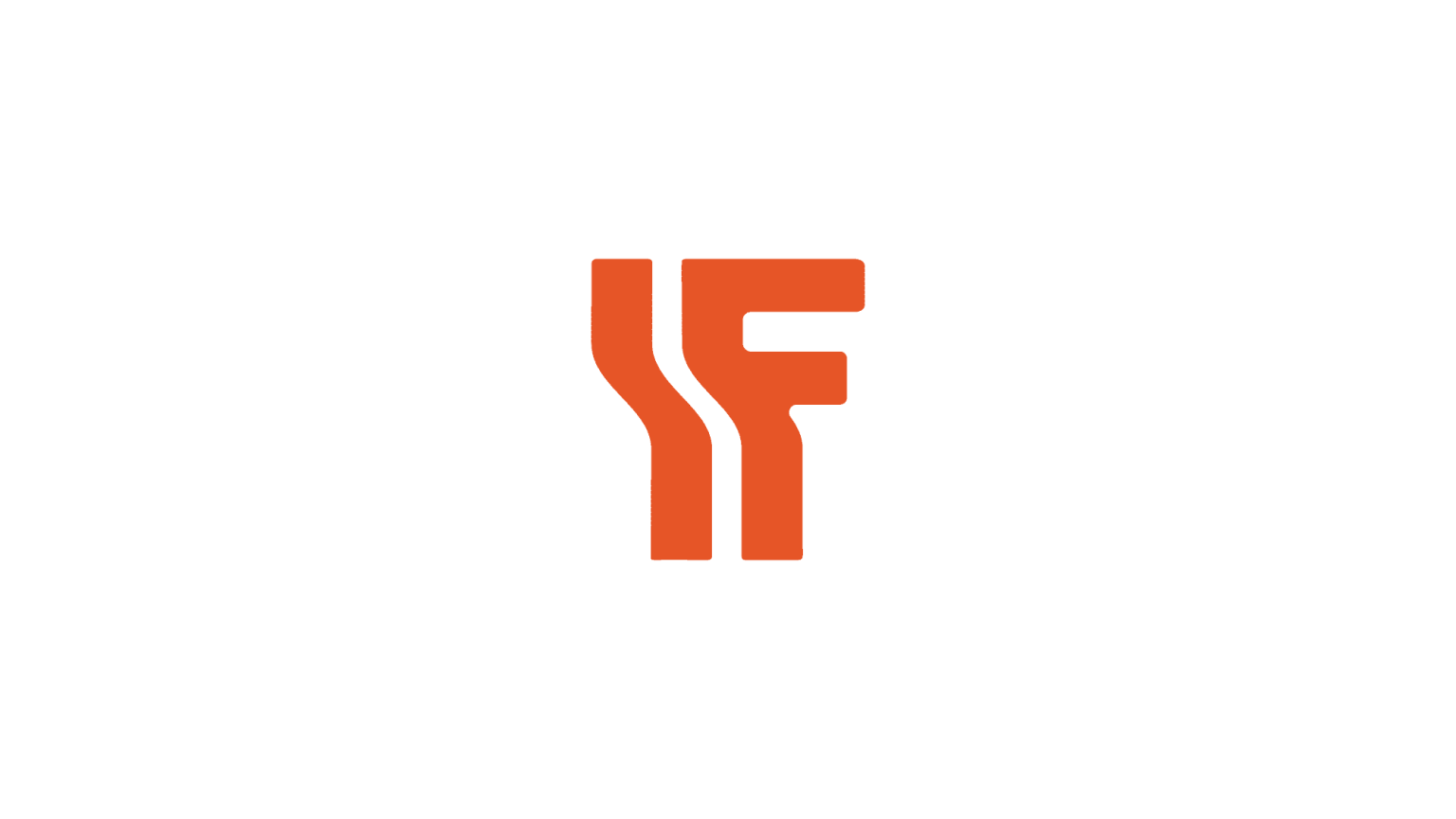
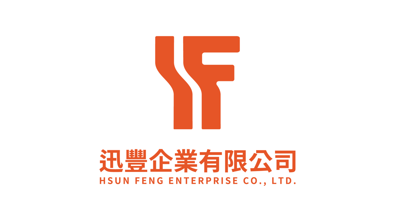
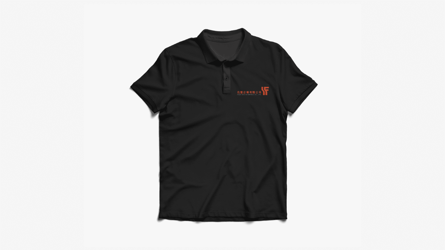
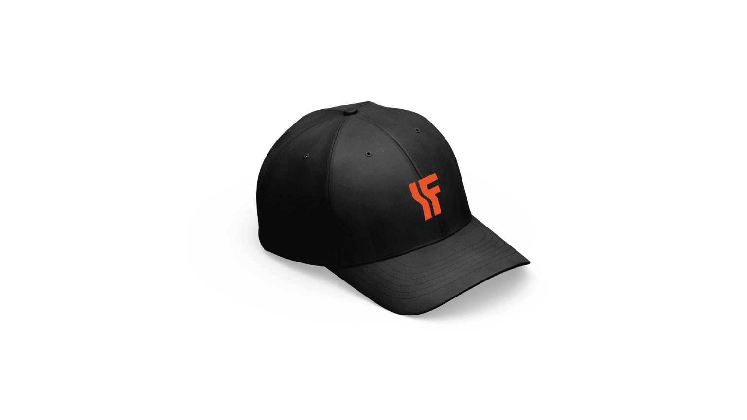
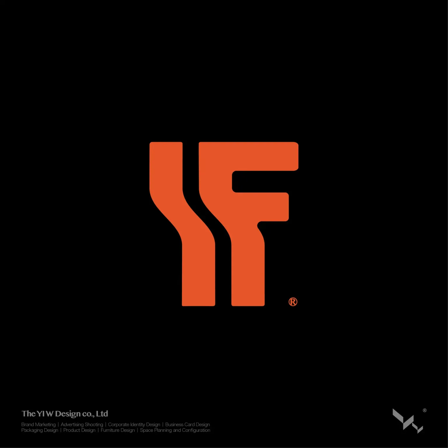
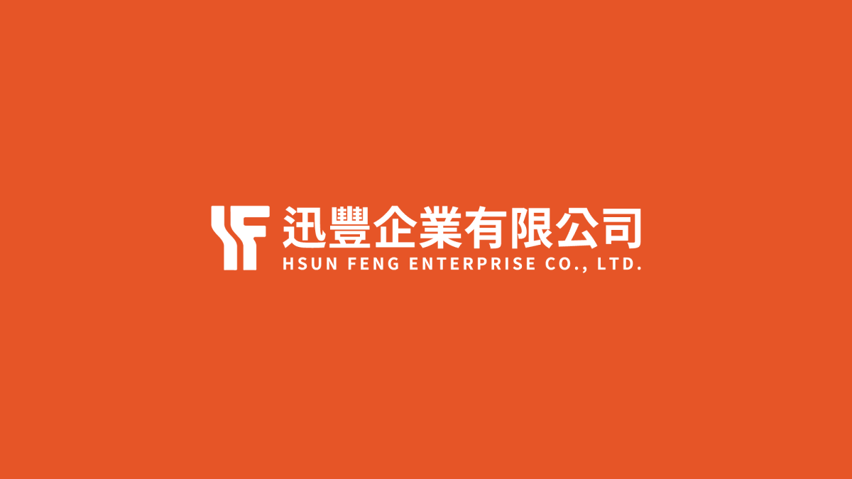
設計以企業英文縮寫 H 與 F 為核心出發點,透過幾何重構建立具有結構感與識別性的品牌標誌。
視覺語言採用穩定且具重量感的造型結構,象徵金屬材料的堅實特性與產業的專業基礎。同時融入「資源循環與再生」的概念,透過向下延伸與向上延展的視覺隱喻,呈現材料從回收、轉化到再利用的循環過程,強化品牌在永續產業鏈中的角色。
Outcome
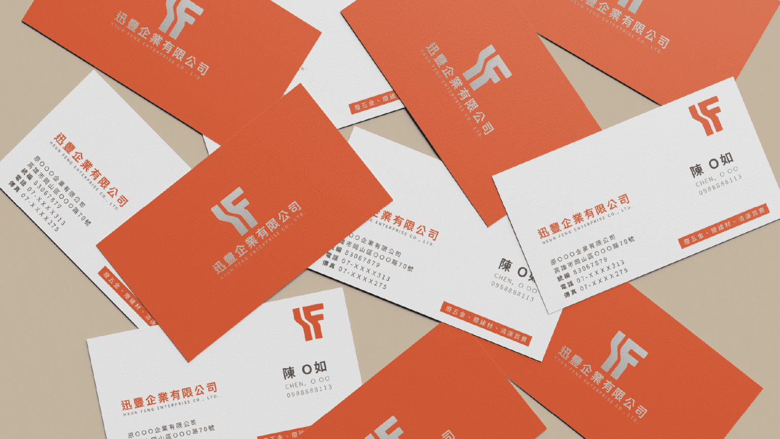
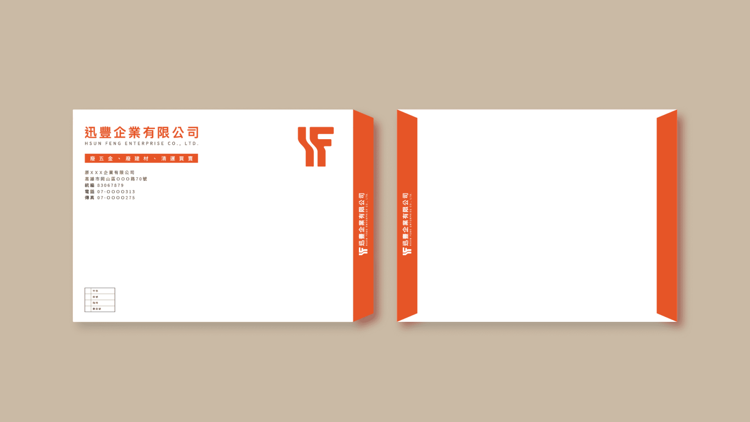
最終建立一套具備穩定性與循環意象的品牌識別系統,使迅豐企業在廢五金回收與再生資源產業中建立更清晰的專業形象,並強化其作為循環經濟供應鏈關鍵角色的市場信任度。
Context
Shun Feng Enterprise specializes in scrap metal recycling and secondary resource processing, including collection, sorting, and material recovery. As circular economy practices become increasingly important, the brand required a more contemporary and trustworthy identity system to strengthen its positioning within the recycling industry.
Approach
The design is based on the company initials “H” and “F,” reinterpreted through geometric reconstruction to a structured and recognizable identity system.
The visual language adopts solid and weight-driven forms, reflecting the physical nature of metal materials and the industrial foundation of recycling. The concept of circular transformation is embedded through upward and downward visual movement, symbolizing the process of collection, refinement, and reuse within the resource cycle.
Outcome
The resulting identity system establishes a stable and conceptually grounded brand presence for Shun Feng Enterprise, reinforcing its role within the scrap metal recycling and circular economy ecosystem while enhancing trust and professional recognition in the industry.