首頁 > 精選案例 > LOGO Design > INNOVAHUB
INNOVAHUB
| Service | LOGO Design |
| Year | 2023 |
Context
INNOVAHUB 為 TAMP 所開發之 AMPdr 架構下 DIUP 計畫之一,旨在建立全球醫師與專業人士之間的連結平台,促進跨地域的知識交流與專業能力提升。在此背景下,品牌需要一套能夠體現專業性、連結性與國際視野的視覺識別系統。
Approach
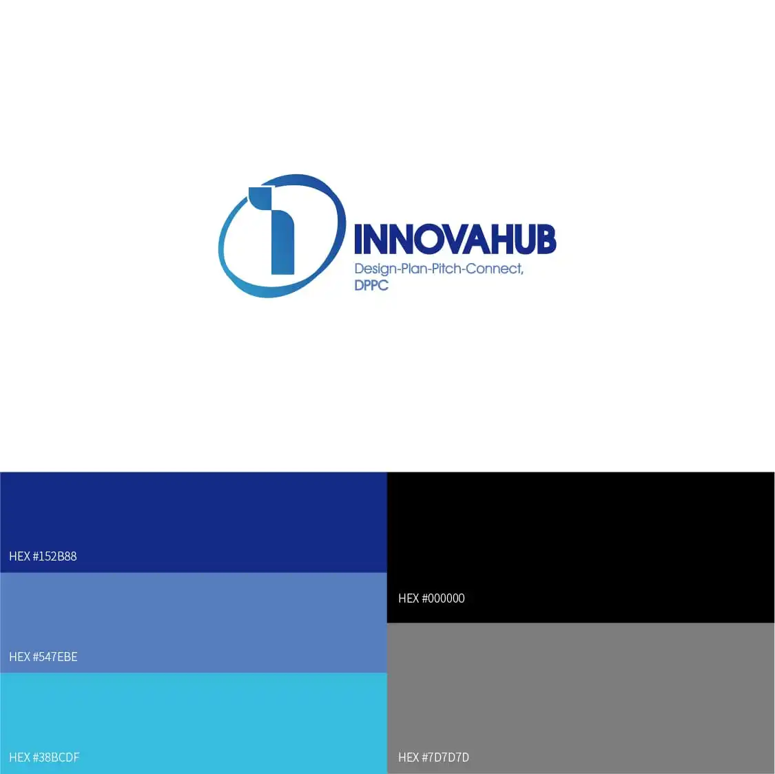
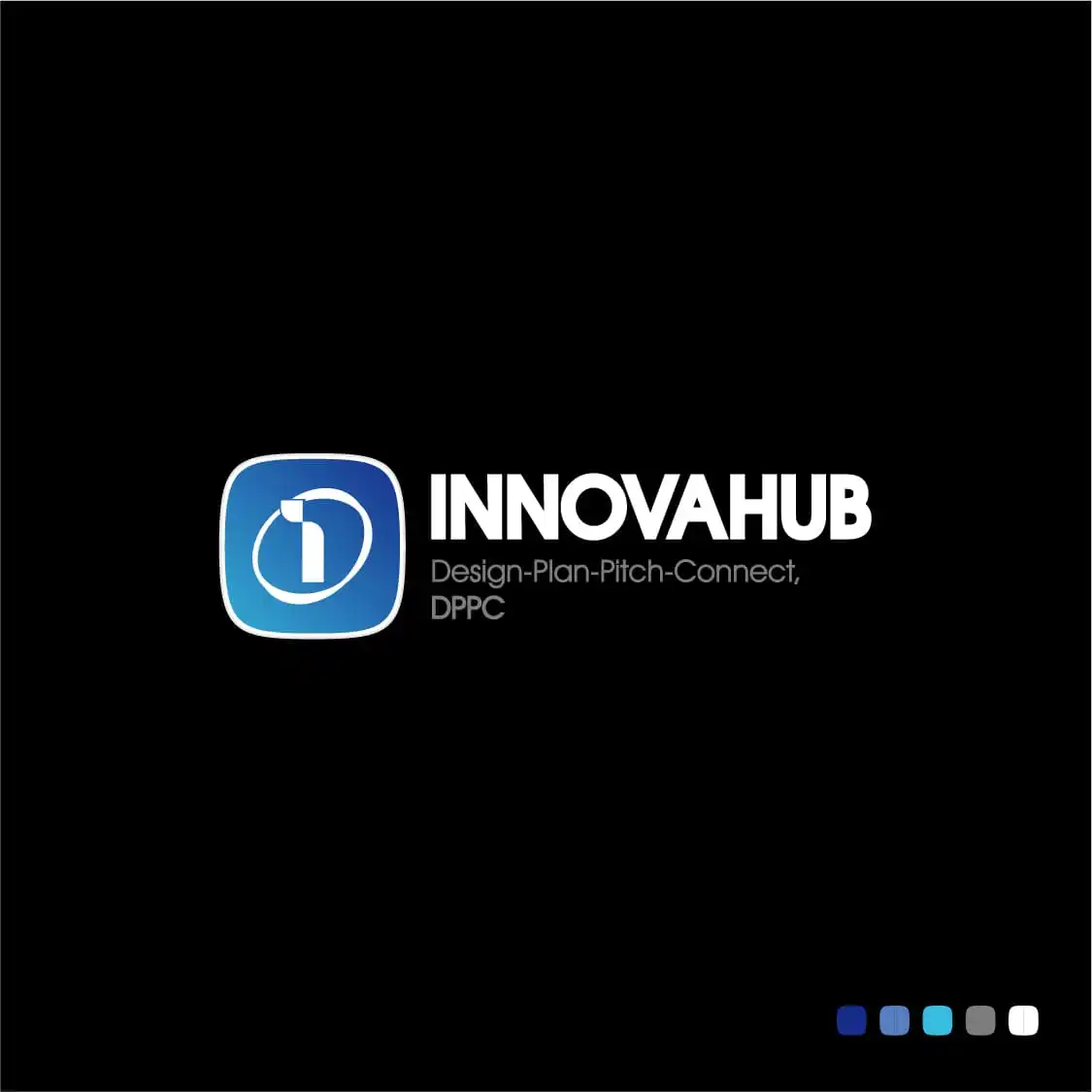
設計以「全球連結與個體參與」為核心概念,將品牌縮寫中的字母結構轉化為視覺語言。透過 I、N、O 的重組與延伸,建立具有象徵性的標誌系統,其中 I 代表個體,N 作為連結關係的隱喻,O 則轉化為全球視覺意象。
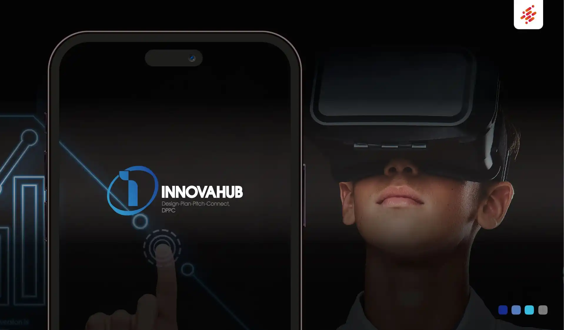
整體識別以簡潔且具科技感的幾何語言構成,強調資訊流動與全球網絡的連結特性,建立一致且具延展性的品牌視覺基礎。
Outcome
最終設計建立一套具備高度識別性與國際語境的品牌標誌,使 INNOVAHUB 能在全球醫療專業社群中清晰定位,強化平台的專業形象與連結價值,並支持其長期擴展與國際化發展。
Context
INNOVAHUB is one of the DIUP initiatives within the AMPdr ecosystem developed by TAMP. The program aims to connect physicians and healthcare professionals worldwide, enabling cross-border knowledge exchange and continuous professional development. In this context, the brand required a visual identity system that reflects professionalism, connectivity, and a global perspective.
Approach
The design is centered on the concept of global connectivity and individual participation. The brand initials were reinterpreted into a structured visual system, where the letters “I,” “N,” and “O” form the foundation of the identity. “I” represents the individual, “N” symbolizes connection, and “O” becomes a visual metaphor for the globe.
The identity is constructed using a clean, geometric, and technology-oriented visual language, emphasizing information flow and global network connectivity while maintaining clarity and scalability.
Outcome
The final identity system establishes a strong and internationally aligned brand presence for INNOVAHUB, enabling clear positioning within the global medical community. It strengthens the platform’s perception as a professional and connected knowledge network, supporting long-term scalability and international growth.