首頁 > 精選案例 > LOGO Design > DWOP
DWOP
| Service | LOGO Design |
| Year | 2023 |
Context
DWOP(Digital Wellness Outreach Program)為 TAMP 所開發之 AMPdr 應用中的數位學習計畫,旨在為醫師提供持續更新的專業學習資源。在醫療科技快速演進的背景下,醫師對知識更新與專業成長的需求日益提升,因此品牌需要一套更清晰且具信任感的視覺識別系統,以支撐其專業定位。
Approach
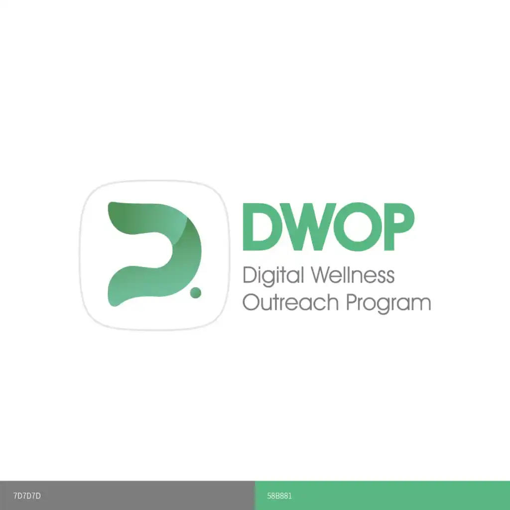
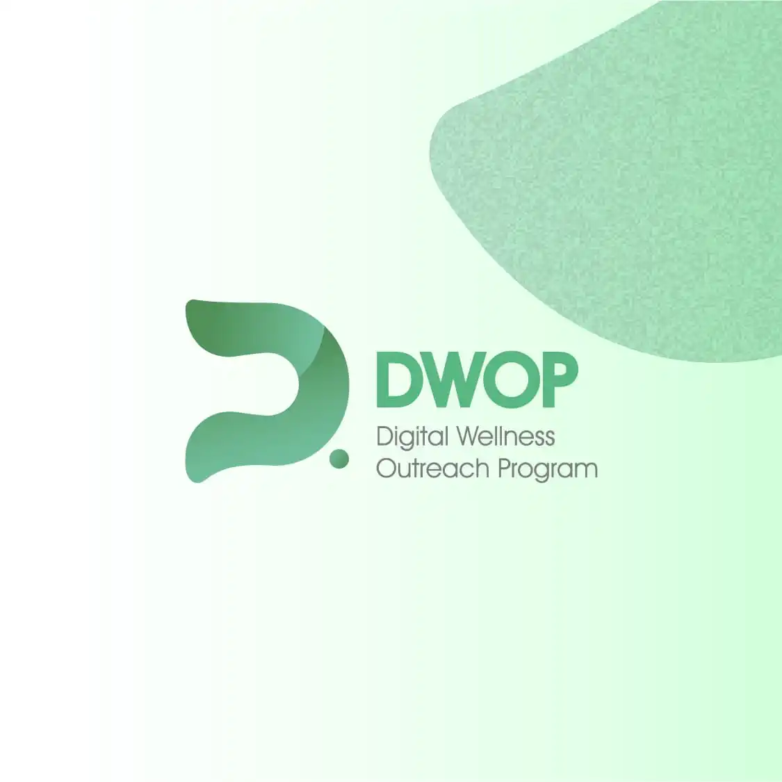
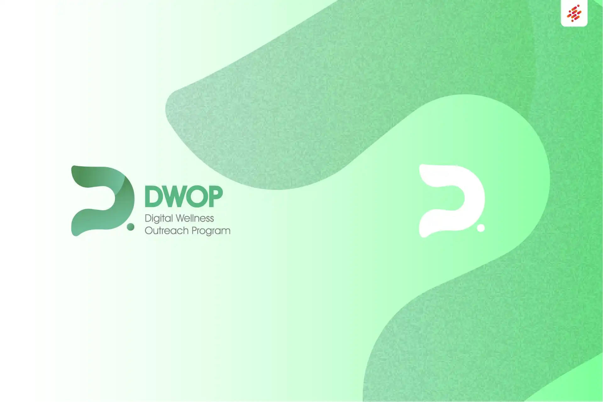
本次設計以「數位學習與專業成長」為核心概念,重新建立識別系統的視覺結構。透過字母 D 與 P 的整合,發展出具辨識度的品牌標誌,並以簡潔且理性的幾何語言呈現醫療科技的專業性與穩定感。
色彩選擇上採用綠色系,象徵健康、成長與持續進步,使品牌在醫療與數位學習情境中建立一致且可信賴的視覺印象。
Outcome
最終建立一套具備高度識別性與專業感的品牌標誌,使 DWOP 能在醫療數位學習領域中建立清晰定位,強化醫師族群對平台的信任感與使用連結,並支持未來計畫的持續擴展。
Context
DWOP (Digital Wellness Outreach Program) is a digital learning initiative within the AMPdr application developed by TAMP. It is designed to provide healthcare professionals with continuous access to updated medical knowledge. As medical technology evolves rapidly, the need for ongoing learning and professional development among physicians has significantly increased, requiring a clearer and more trustworthy visual identity system.
Approach
The design approach centers on digital learning and professional growth, establishing a clear and structured visual identity system. By integrating the letterforms “D” and “P,” the logo forms a distinctive and recognizable mark expressed through a minimal and geometric visual language, reflecting the precision and reliability of the medical field.
A green color palette was adopted to represent health, growth, and continuous improvement, reinforcing a consistent and trustworthy presence across both medical and digital learning environments.
Outcome
The resulting identity system delivers a clear and professional visual foundation for DWOP, strengthening its positioning within the medical digital learning space. It enhances trust among healthcare professionals and supports long-term scalability as the program continues to grow.