首頁 > 精選案例 > LOGO Design > 盛美開發有限公司
盛美開發有限公司
| Service | Logo Redesign |
| Year | 2024 |
| Client | 盛美開發有限公司 |
| Design | The Yi W Design |
Context
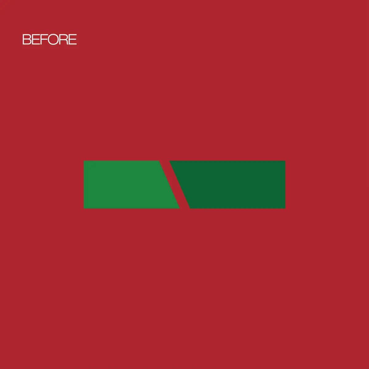
盛美開發專注於海苔與紫菜相關產品,原有品牌識別在市場溝通上較為傳統,缺乏清晰的視覺記憶點與現代化延展性。品牌希望透過識別重塑,強化其在食品產業中的專業形象與辨識度。
Approach
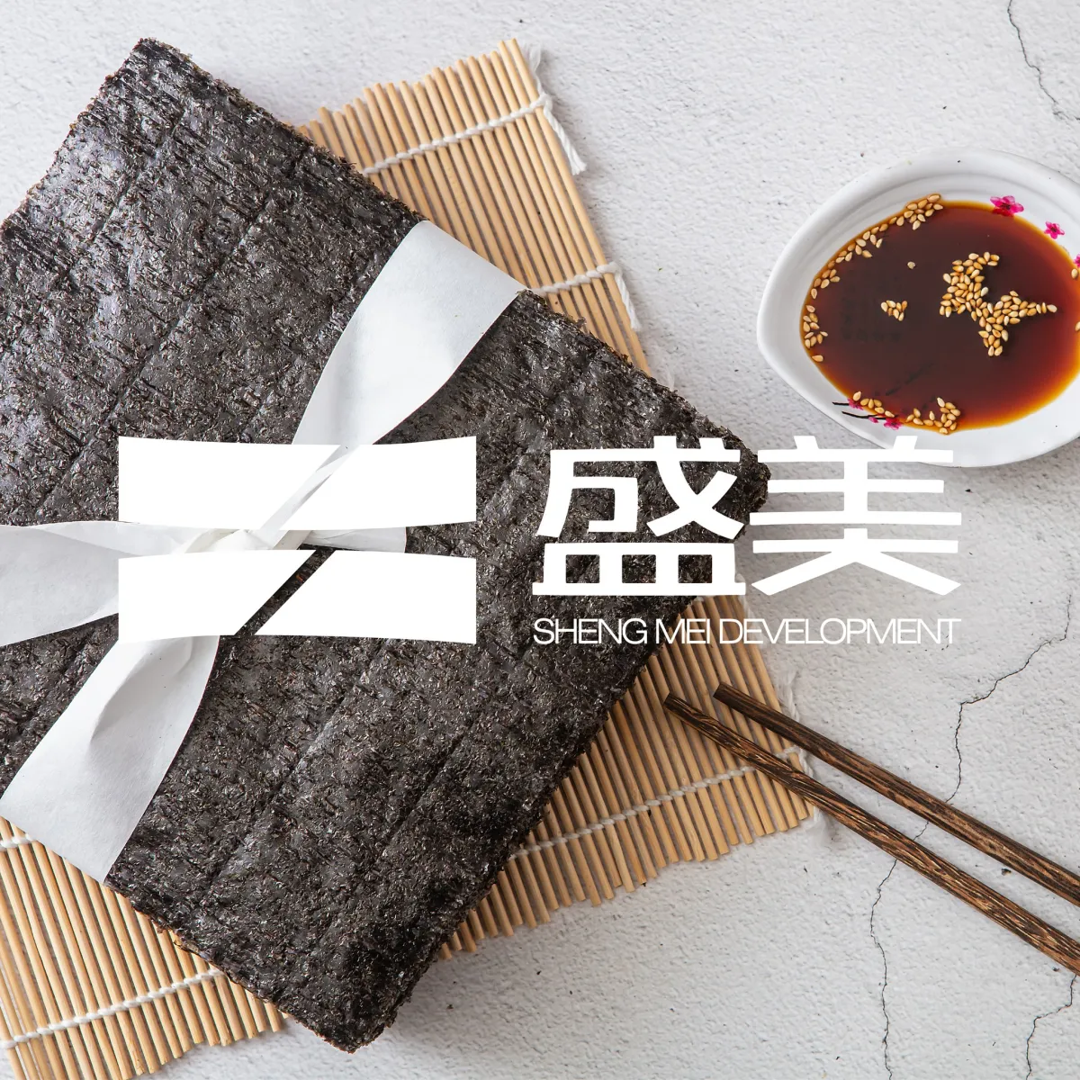
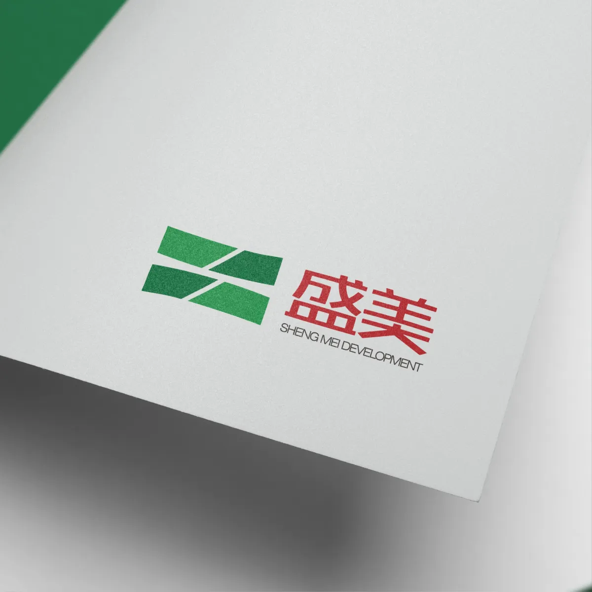
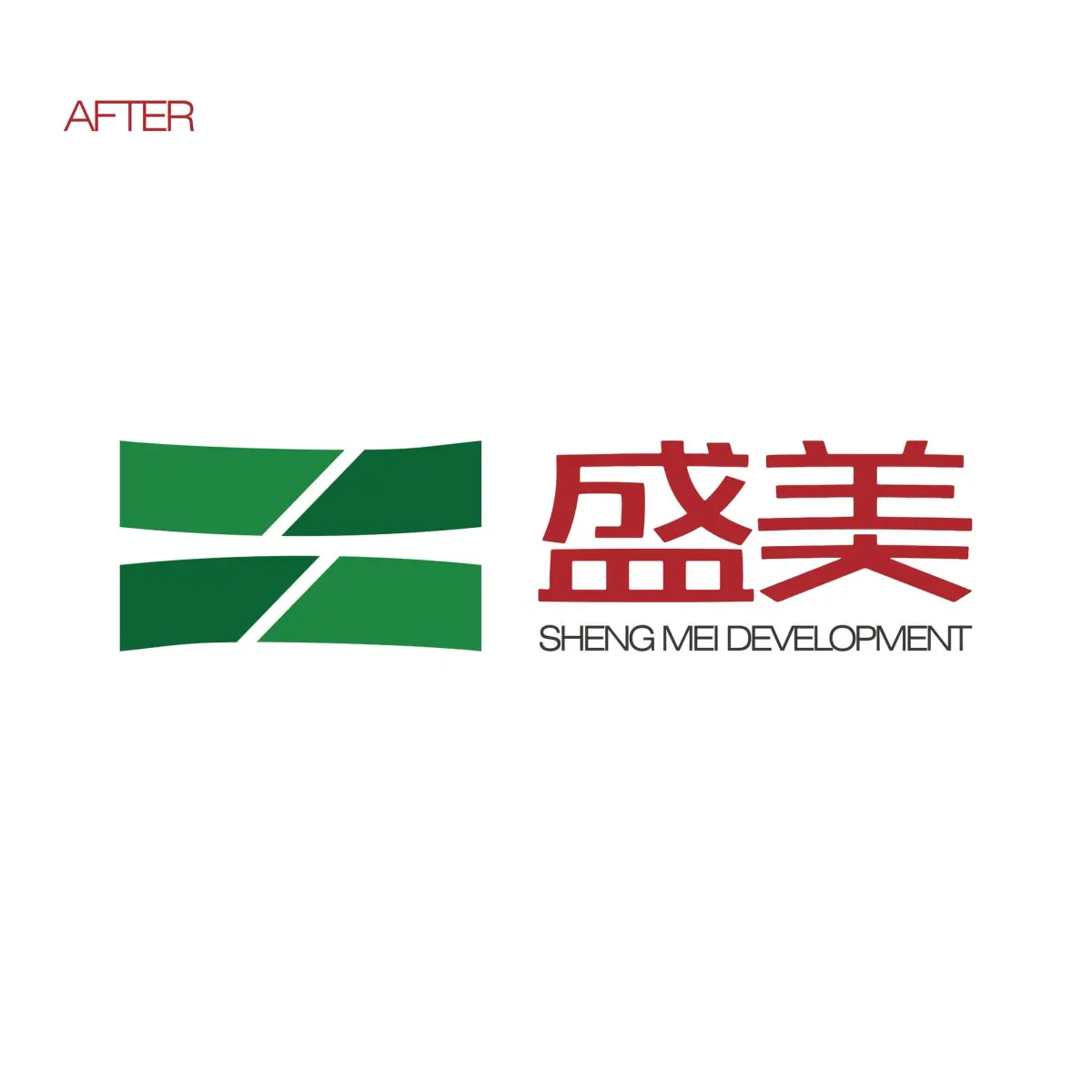
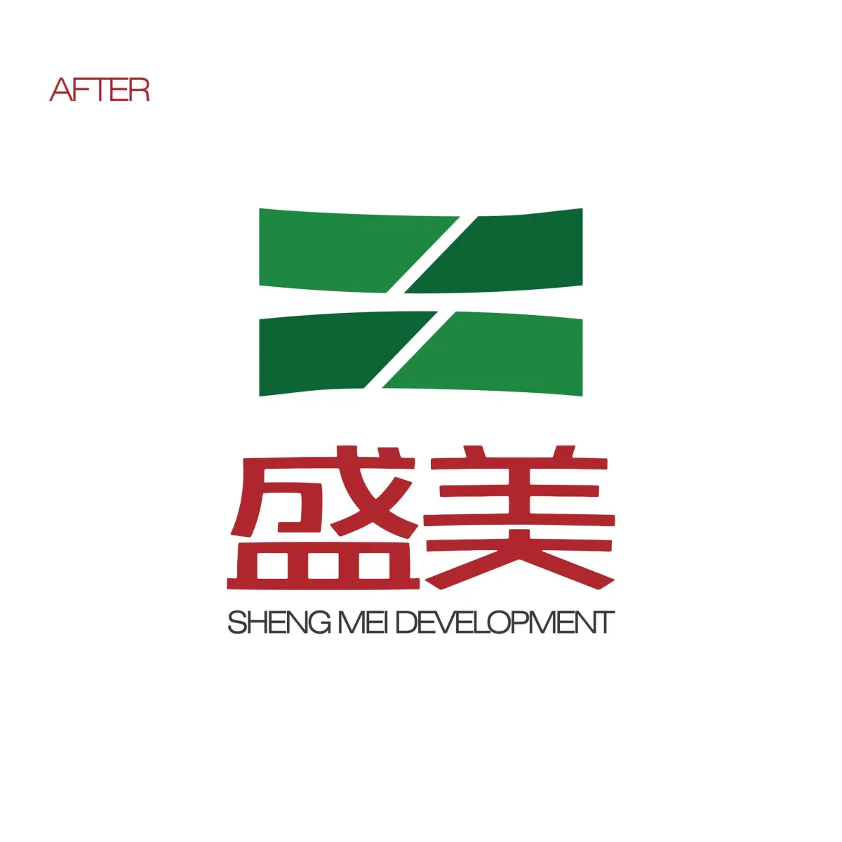
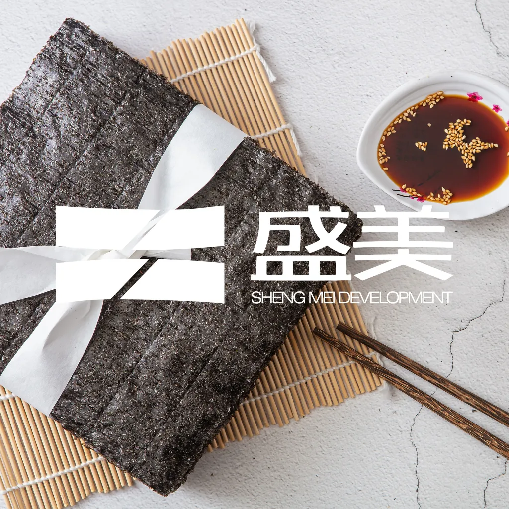
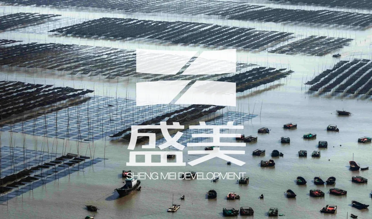
本次設計從品牌核心「海洋食材」出發,重新整理視覺語言,使其能更直接反映產品本質與品牌精神。設計過程中,我們將品牌首字母結構轉化為識別基礎,並透過造型重組,使標誌從原本較制式的形態轉化為更具流動性與生命感的視覺符號。
同時,在幾何比例與線條節奏上進行優化,使標誌在保有簡潔結構的同時,也能呈現更具現代感的品牌性格,並確保其在不同應用情境中的清晰度與延展性。
Outcome
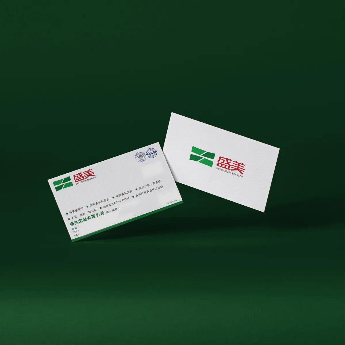
最終完成的識別系統,使盛美開發在視覺上建立更清晰且一致的品牌形象,提升市場辨識度與專業感。新的標誌不僅強化品牌與產品之間的連結,也為未來品牌延伸與應用建立穩固基礎。
Context
Sheng Mei Development specializes in seaweed and laver products. The original brand identity was rooted in a more traditional visual approach, lacking a clear sense of recognition and scalability. The rebranding aimed to strengthen its professional presence within the food industry and improve overall brand clarity.
Approach
The redesign began with the core concept of “marine ingredients,” reinterpreting the visual language to better reflect the essence of the products and the brand spirit. The brand initials were restructured into a foundational visual system, transforming the original rigid form into a more fluid and dynamic identity.
Through refined geometric composition and balanced visual rhythm, the logo was optimized to maintain simplicity while expressing a more contemporary brand character. The system was also designed to ensure clarity and adaptability across different applications.
Outcome
The new identity system establishes a clearer and more consistent brand presence for Sheng Mei Development, enhancing recognition and perceived professionalism in the market. Beyond improving brand visibility, the redesigned logo also provides a scalable foundation for future brand expansion and applications.