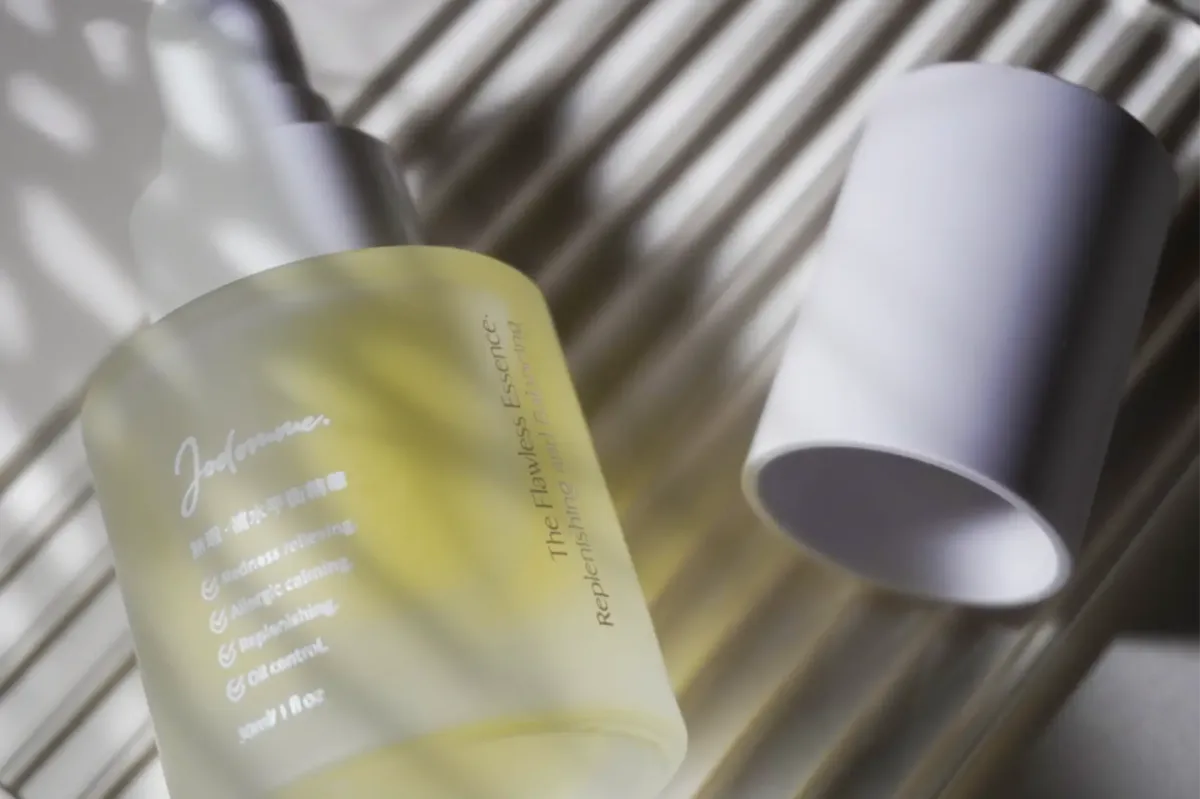
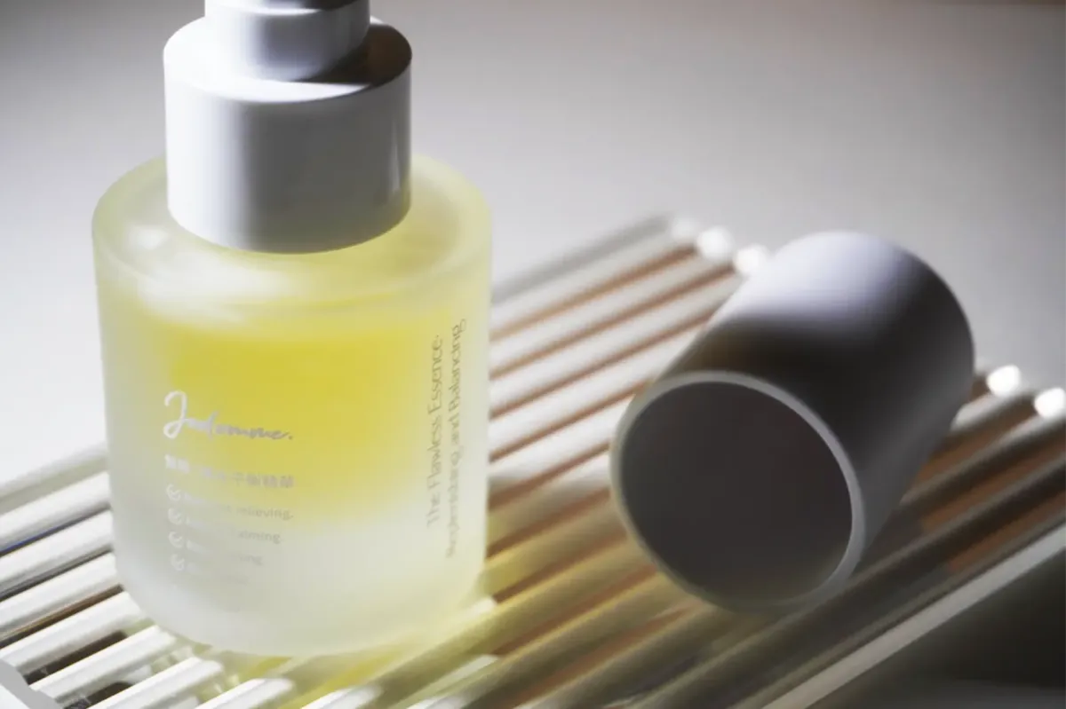
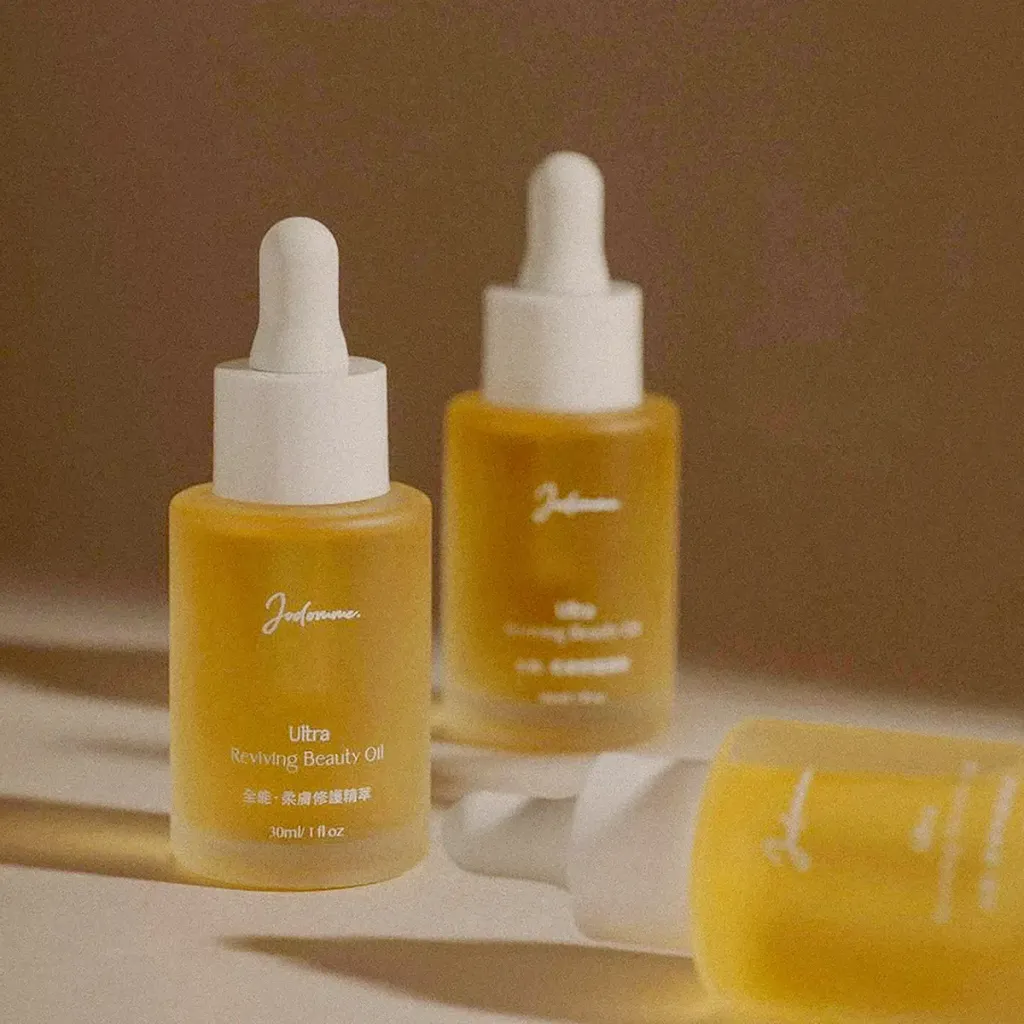
Jodomme|補水・平衡精華
| Service | Packaging Design |
| Year | 2025 |
Context
Jodomme 持續以「天然、純淨與簡化保養程序」為核心理念,推出補水・平衡精華產品,期望在多步驟保養趨勢中,重新定義肌膚基礎保養的角色,並建立更一致的品牌產品語言。
Approach
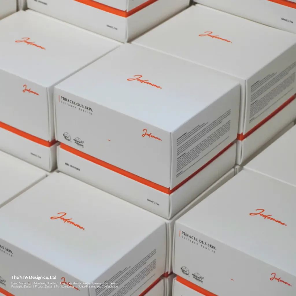
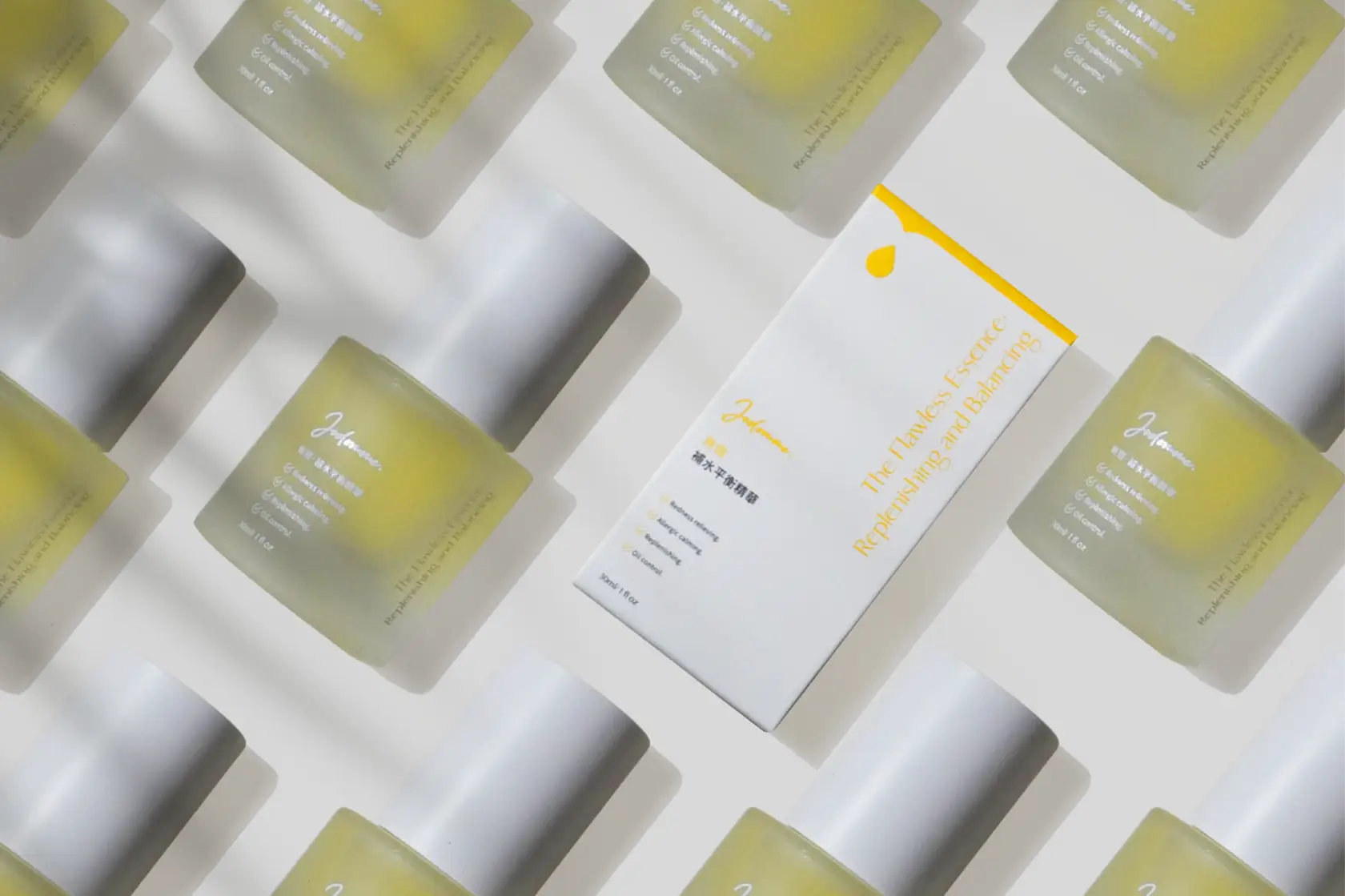
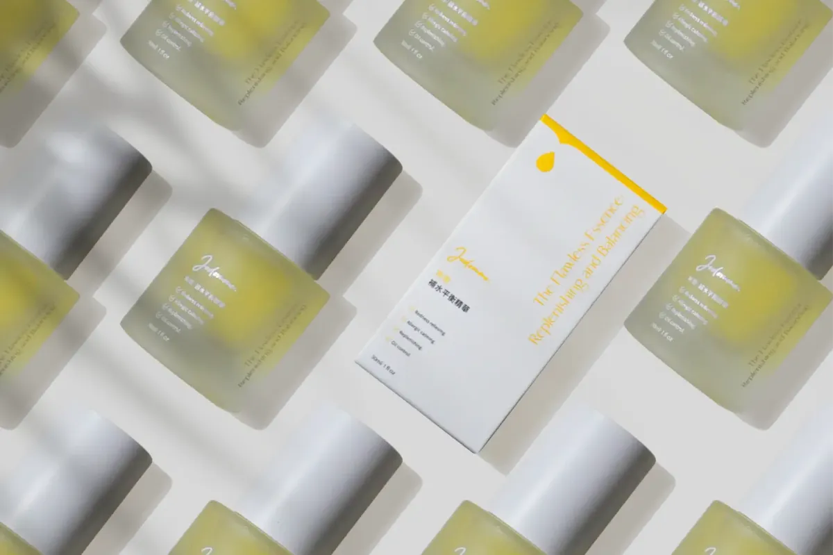
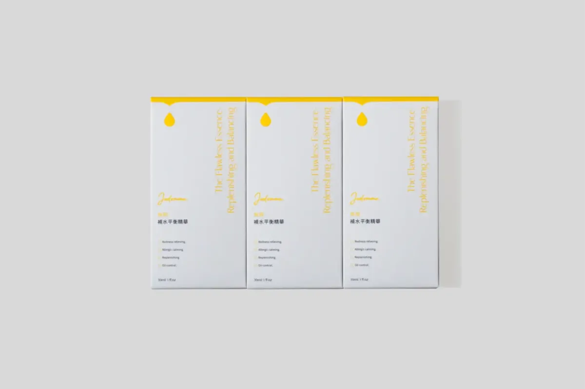
設計延續 Jodomme 一貫的品牌視覺系統,以極簡且具質感的方式構建包裝語言,使紙盒與瓶身在視覺上形成一致且連貫的系列感。
透過乾淨的版面結構與低干擾的視覺表現,讓產品資訊與品牌質感回歸純粹,並以整體系統性設計取代單一產品的表現方式,使不同產品之間能自然延伸為統一的品牌系列。
Outcome
最終建立一套具備一致性與延展性的包裝系統,使 Jodomme 補水・平衡精華能夠融入既有品牌架構之中,強化整體產品線的識別性與系統感,並深化品牌「純淨、簡化與回歸本質」的核心價值。
Context
Jodomme continues to build on its core philosophy of natural purity and simplified skincare routines with the introduction of the Hydrating & Balancing Essence. The product aims to redefine foundational skincare within multi-step routines and strengthen a more cohesive product language across the brand.
Approach
The design extends Jodomme’s established visual system, applying a minimal and refined packaging language to a consistent series identity across both bottle and secondary packaging.
Through clean composition and reduced visual noise, the design prioritizes clarity and material expression, allowing the system to replace product-level differentiation with a unified brand-led approach.
Outcome
The resulting packaging system establishes a coherent and scalable identity for the Hydrating & Balancing Essence, reinforcing its integration within the broader Jodomme product line and strengthening the brand’s commitment to purity, simplification, and essential skincare values.
 >
>