中華民國血脂及動脈硬化學會春季會(2023)
| Service | Key Visual Design |
| Year | 2023 |
| Client | 社團法人中華民國血脂及動脈硬化學會 |
| Agency | 群嚮會展顧問股份有限公司 |
| Design | The Yi W Design |
| Image Credit | 群嚮會展顧問股份有限公司 |
Context
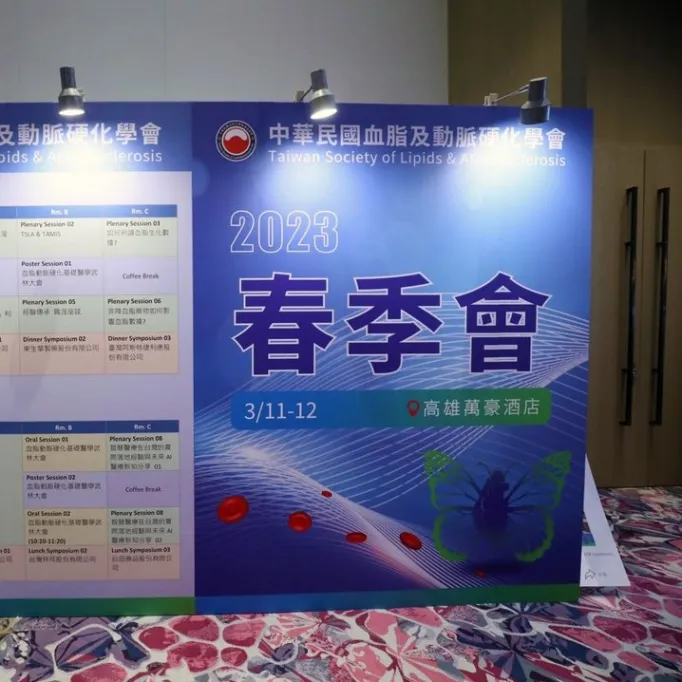
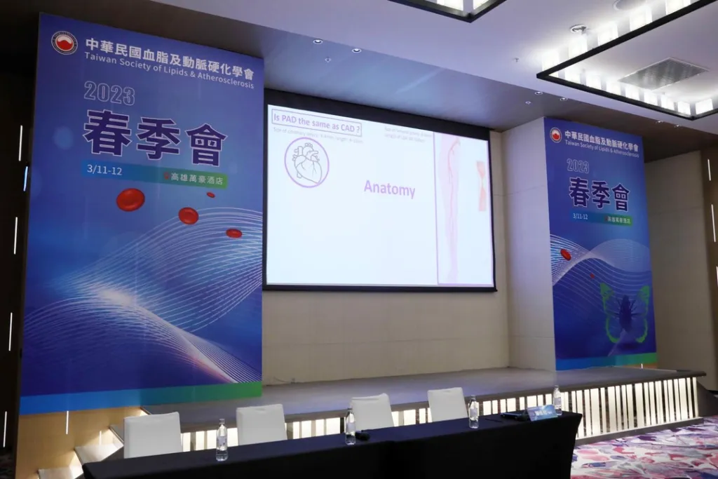
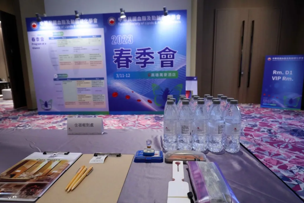
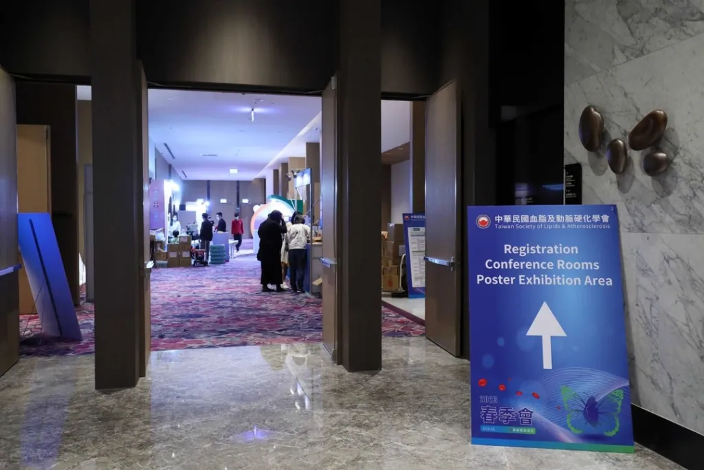
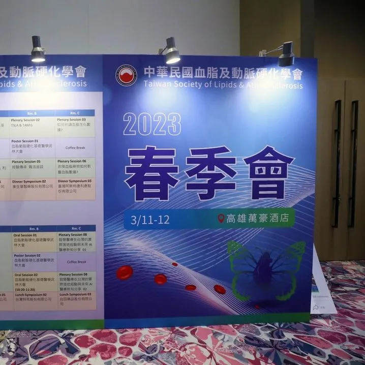
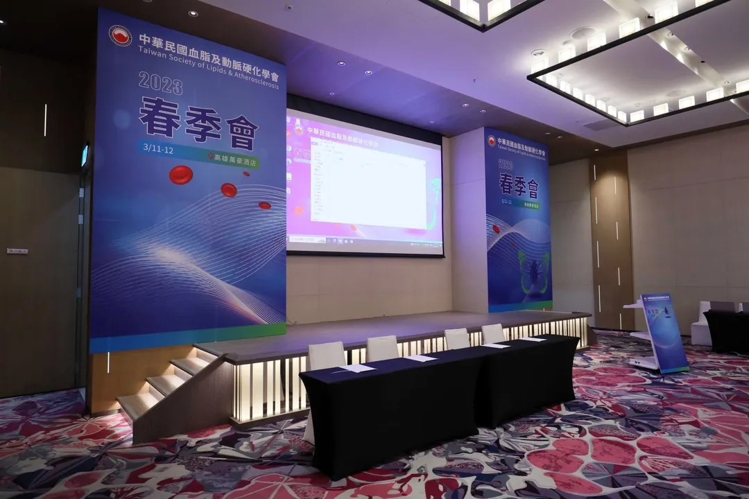
本次專案為中華民國血脂及動脈硬化學會春季會之整體主視覺設計,應用於活動主視覺、背板系統、議程看板及大會手冊等多元延伸載體。設計需同時兼顧醫學專業性、學術嚴謹性與活動識別的一致性。
Approach
設計以「循環系統與生命動能」為核心概念,將心臟意象與蝴蝶翅膀進行視覺整合,轉化為象徵血液循環與動態平衡的抽象圖像語言。
整體視覺系統採用現代化的色彩配置與動態構成方式,強化流動性與科技感,同時在資訊架構上導入清晰的層級設計,以確保學術內容在多場景應用中的可讀性與一致性。
在延伸概念上,融入數位醫療與 AI 發展的視覺語彙,使主視覺同時回應未來醫療科技的發展趨勢。
Outcome
最終建立一套具備專業性與延展性的活動主視覺系統,使本次學會春季會在學術傳達與視覺識別上達到一致整合,並強化其作為醫學交流平台的現代化形象。
Context
This project involved the key visual design for the 2023 Spring Conference of the Taiwan Society of Lipids and Atherosclerosis. The visual system was applied across multiple touchpoints, including stage backdrops, agenda boards, and conference materials, requiring a balance between medical professionalism, academic rigor, and visual consistency.
Approach
The design is based on the concept of circulatory systems and biological energy flow, integrating visual references of the heart and butterfly wings into an abstract representation of blood circulation and dynamic balance.
A contemporary color system and dynamic composition were applied to emphasize flow and technological sensibility, while a structured information hierarchy ensured clarity and readability across different applications.
The visual system also incorporates references to digital healthcare and AI development, positioning the conference within the context of future medical innovation.
Outcome
The resulting system establishes a cohesive and scalable visual identity for the conference, strengthening both its academic communication and visual recognition, while reinforcing its modern positioning as a medical knowledge exchange platform.