首頁 > 精選案例 > LOGO設計 LOGO Design > 朝日藥局
朝日藥局
| Service | LOGO Design |
| Year | 2020 |
Context
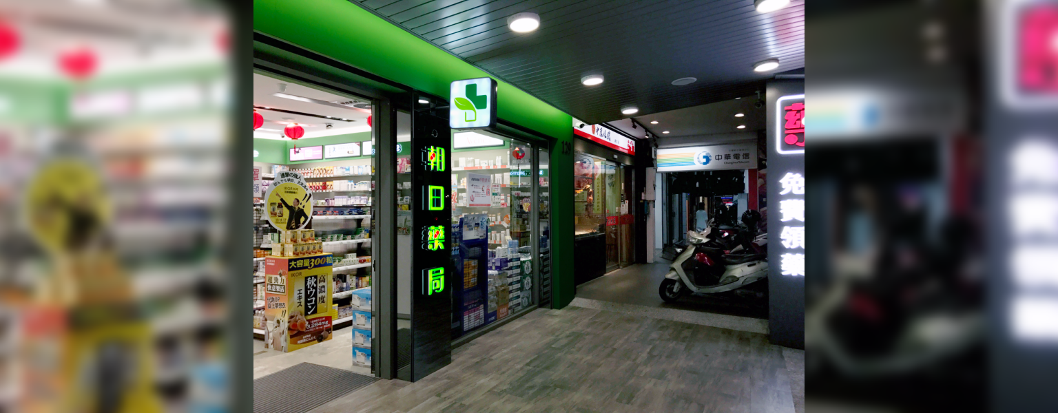
朝日藥局位於桃園中壢的核心商圈,在高度競爭且生活節奏快速的零售環境中,品牌需要建立更具信任感與專業性的視覺識別系統,以強化其作為社區健康照護據點的定位。
Approach
設計以「健康守護與專業服務」為核心概念,發展清晰且具親和力的品牌視覺語言。
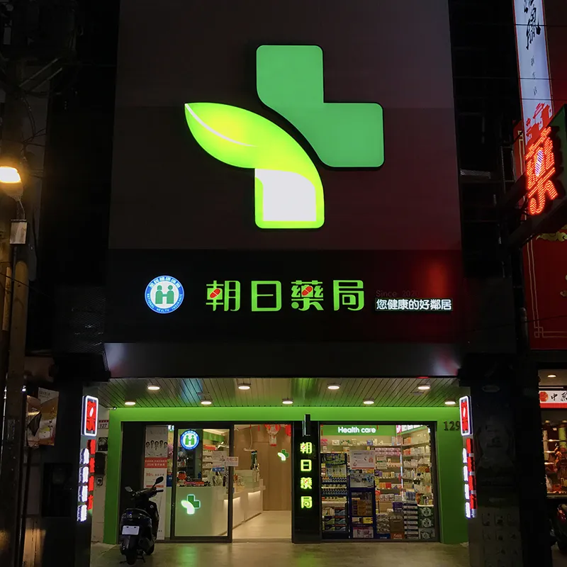
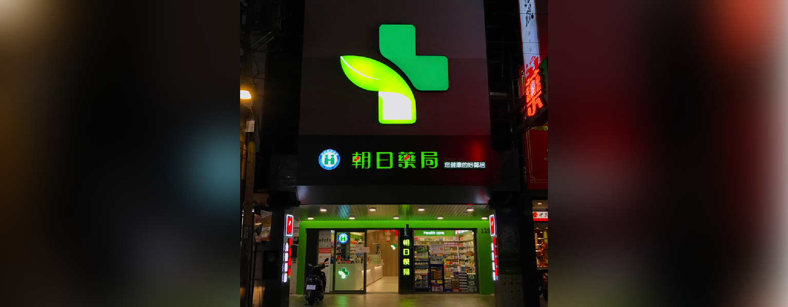
透過簡潔且穩定的結構設計,建立易於辨識的品牌標誌系統,並在視覺語彙中融入醫療產業的潔淨感與秩序感,使品牌在零售環境中能夠快速建立信任。同時強化空間與識別的一致性,讓品牌在實體門市中延伸為完整的視覺體驗。
Outcome
最終建立一套兼具專業性與親和力的品牌識別系統,使朝日藥局在區域市場中強化其健康照護角色,並提升品牌在消費者心中的信任感與可辨識度。
Context
Asahi Pharmacy is located in the central commercial district of Zhongli, Taoyuan. Within a highly competitive and fast-paced retail environment, the brand required a more trustworthy and professional identity system to strengthen its position as a local healthcare provider.
Approach
The design is centered on
healthcare protection and professional service, developing a clear and approachable visual
language.
A simple and stable structural system was created to ensure strong recognition and clarity. The
visual language incorporates a sense of cleanliness and order associated with the healthcare
industry, enabling the brand to build trust quickly in a retail context. Consistency between
identity and spatial experience was also emphasized to extend the brand system into the physical
store environment.
Outcome
The resulting identity system establishes a balance between professionalism and approachability, strengthening Asahi Pharmacy’s role as a community healthcare provider and enhancing trust and recognition within the local market.