首頁 > 精選案例 > LOGO Design > 美臻屋
美臻屋


| Service | Logo Redesign |
| Year | 2023 |
Context
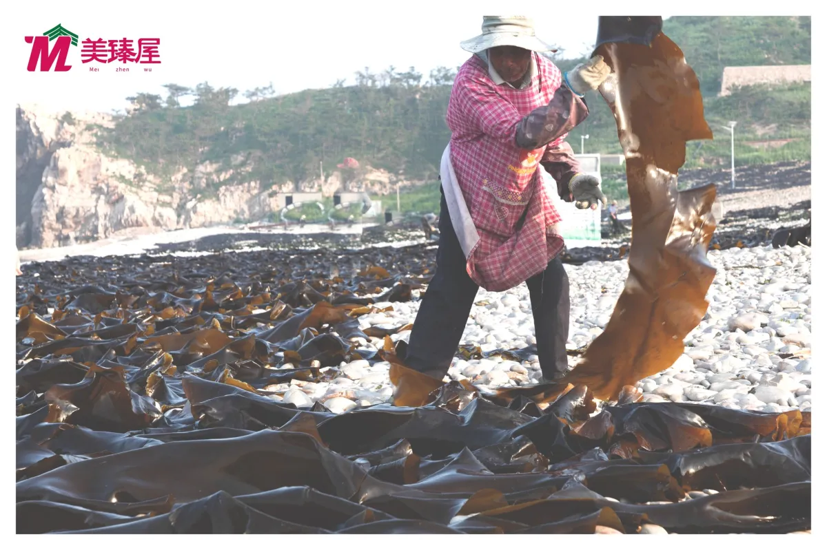
美臻屋是一個專注於海苔與紫菜產品的品牌,希望透過全新的品牌識別建立更鮮明且具辨識度的市場形象。
Approach
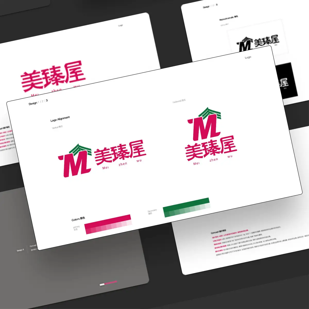
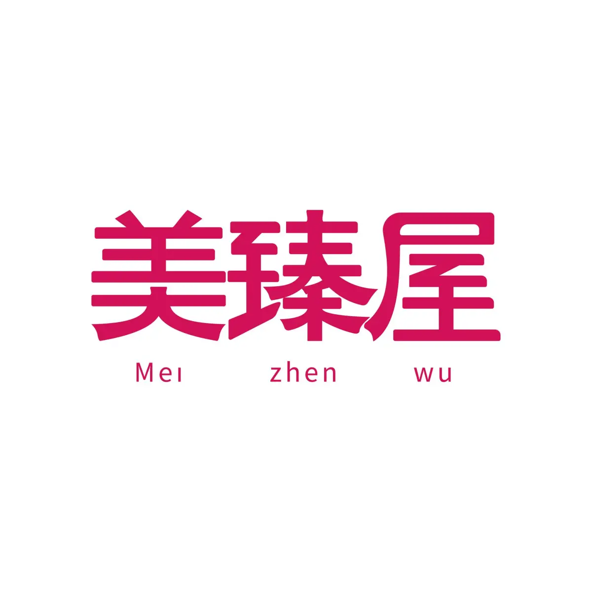
設計以品牌名稱作為核心出發點,將字首字母轉化為專屬識別符號,打造兼具記憶點與延展性的品牌標誌。簡潔而穩定的幾何結構,建立專業且值得信賴的品牌印象,同時保有親切自然的品牌特質。
在視覺表現上,透過深綠色調與俐落線條的運用,呼應產品源自天然食材的本質,並傳遞品牌對品質與細節的重視。整體識別系統兼顧實體包裝與數位應用需求,為品牌建立一致且清晰的溝通基礎。
Outcome
最終打造出一套具備高度辨識性與長期發展潛力的品牌識別,協助美臻屋在競爭市場中建立更鮮明的品牌形象。
Context
Created for a seaweed and laver brand seeking a stronger market presence, the identity was designed to build recognition, consistency, and long-term brand value.
Approach
A distinctive visual mark was developed to a clear and memorable brand asset, supported by a refined system that works seamlessly across packaging, retail environments, and digital touchpoints.
Outcome
The result is a flexible identity that strengthens brand recognition while providing a scalable foundation for future growth.