首頁 > 精選案例 > LOGO Design > Goldparts
Goldparts
| Service | LOGO Design |
| Year | 2021 |
Context
Goldparts 為專注於汽車零件銷售的品牌,主要面向汽車維修與性能升級市場。在競爭激烈且高度專業化的產業環境中,品牌需要建立更具速度感與專業性的視覺識別,以強化市場辨識度。
Approach
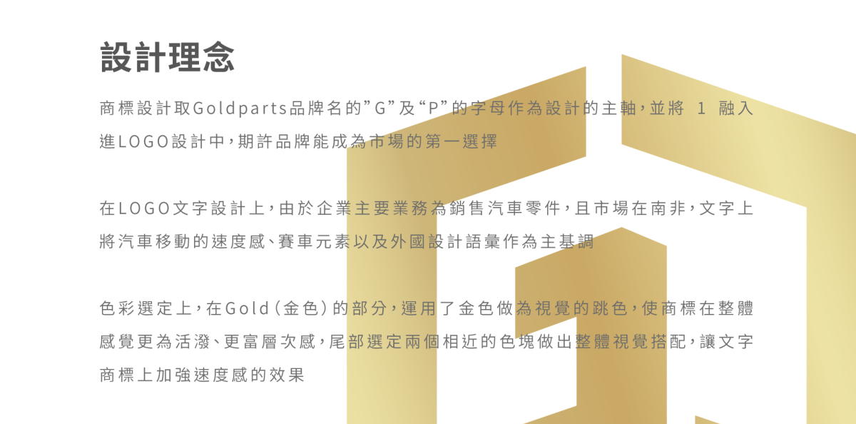
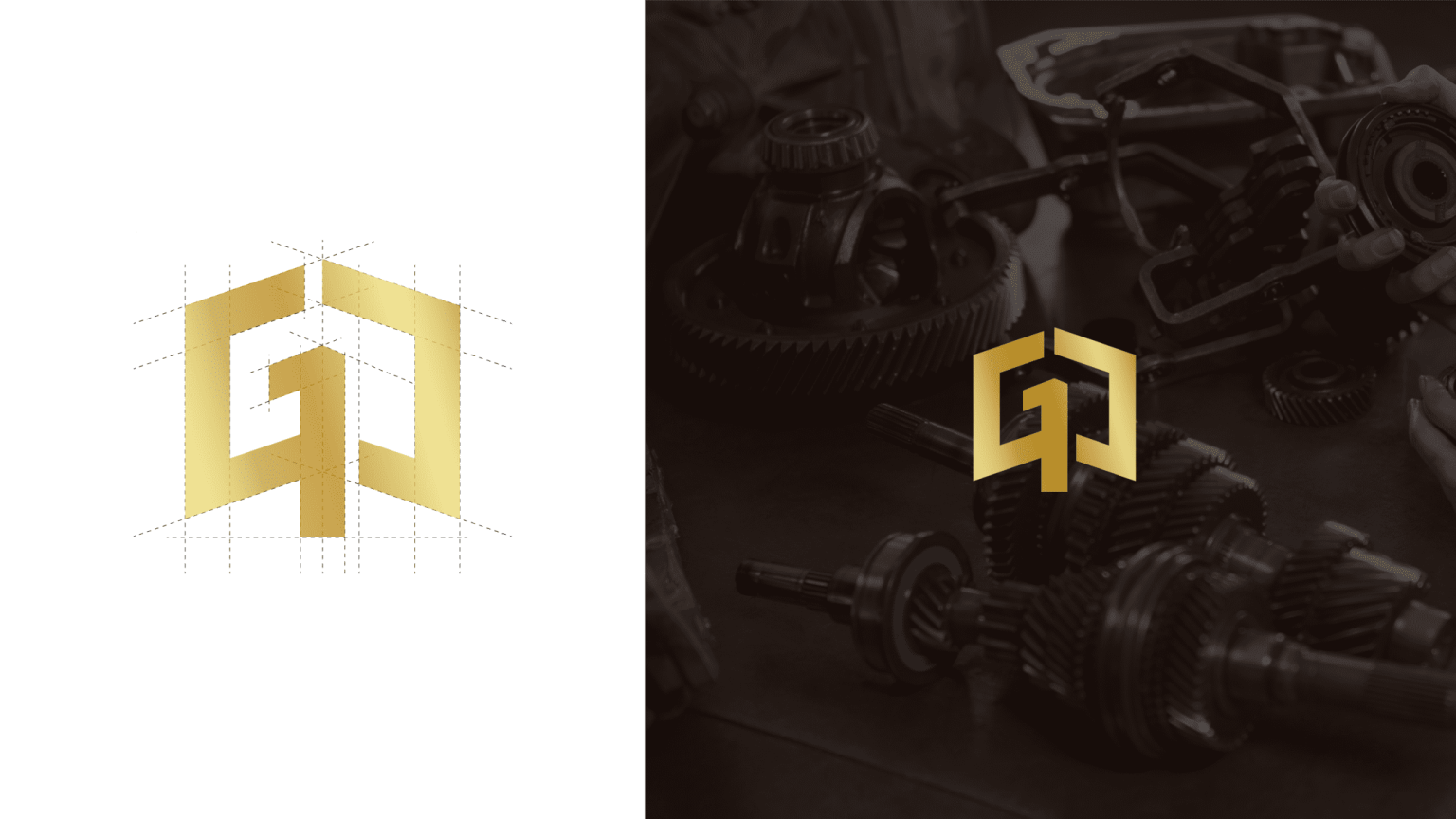
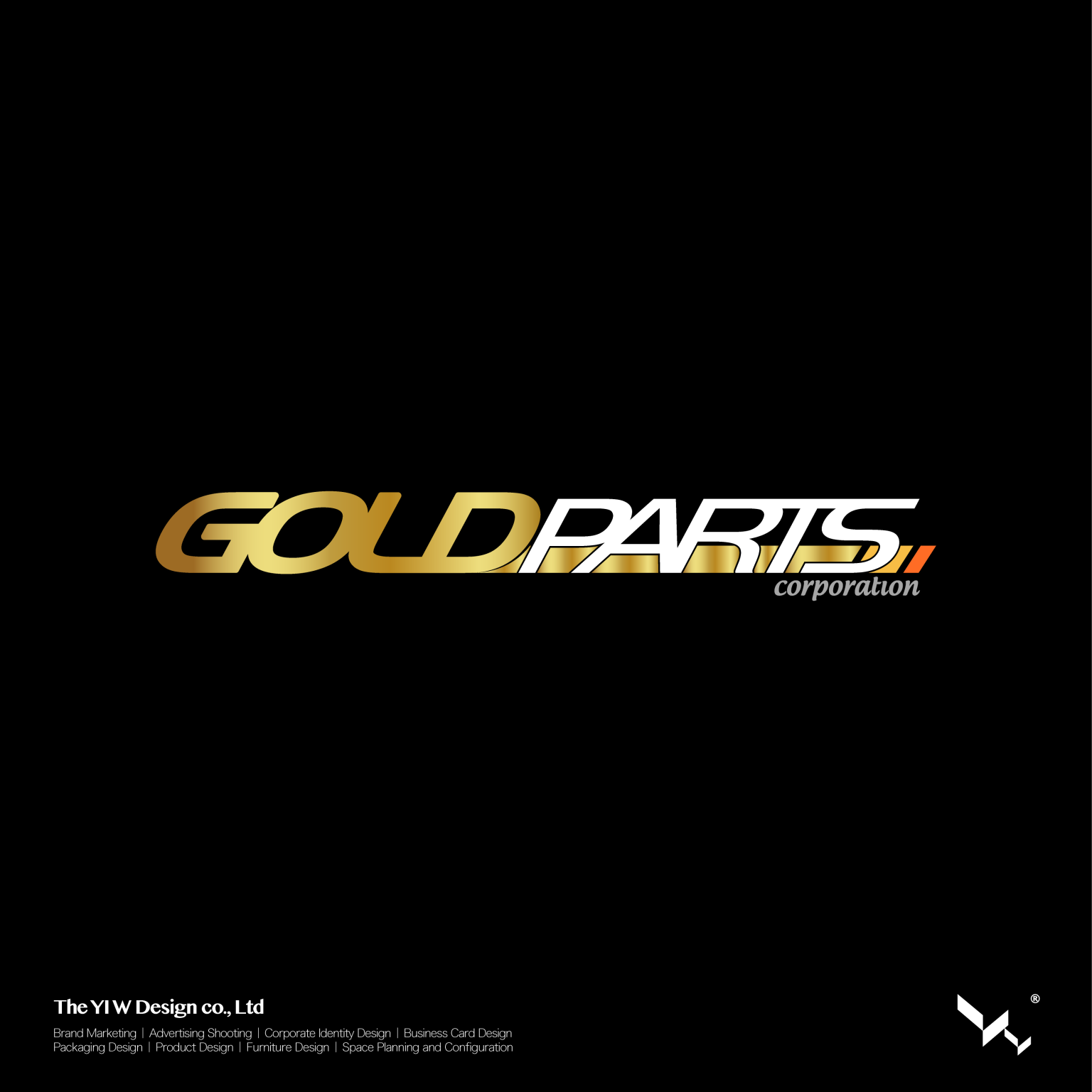
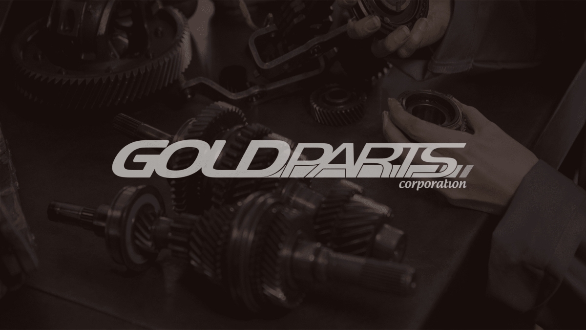
設計以「速度感與性能語彙」作為核心概念,從汽車運動與賽車文化中萃取視覺特徵,並轉化為具幾何結構的品牌標誌語言。
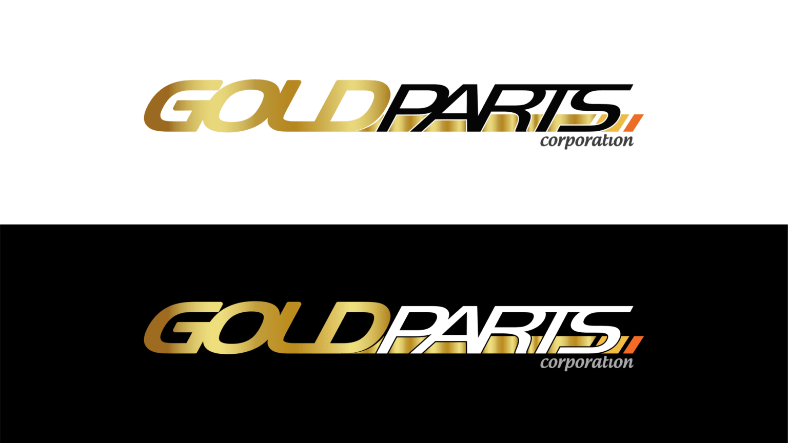
透過動態傾斜比例與緊湊字形結構,營造前進與加速的視覺印象,同時融入具國際語境的設計風格,使品牌在專業汽車零件市場中呈現更具現代感與競爭力的形象。
Outcome
最終建立一套具速度感與識別性的品牌標誌,使 Goldparts 在汽車零件產業中能有效傳達專業性與性能導向的品牌定位,並強化其在市場中的辨識度與信任感。
Context
Goldparts is a brand specializing in automotive parts distribution, serving the repair and performance upgrade market. Within a highly competitive and technical industry, the brand required a stronger visual identity to communicate speed, precision, and professionalism.
Approach
The design is grounded in the concept of speed and performance, drawing visual inspiration from motorsport and racing culture. These elements were translated into a structured geometric identity system.
Through dynamic proportions and compact typographic construction, the logo conveys a sense of acceleration and forward motion. A contemporary and internationally oriented design language was applied to strengthen the brand’s presence within the automotive parts industry.
Outcome
The resulting identity system establishes a clear and recognizable visual presence for Goldparts, reinforcing its positioning as a performance-driven automotive parts brand and enhancing its overall market credibility and recognition.